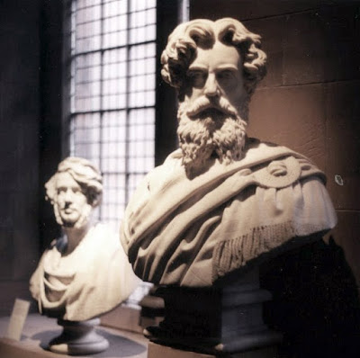
Media: stone
Location: The National Portrait Gallery of Scotland, Edinburgh, UK
I took this photo on my first trip to Edinburgh.

I would like to take a moment to point out some minor annoyances I have with the website for the National Galleries of Scotland. Since I lived in Edinburgh for two years I have grappled with this website a great deal and I have never had a chance to communicate these little irritations.
The first problem with it is that it includes three separate museums all mixed together: the National Gallery of Scotland, The National Portrait Gallery and the Scottish National Gallery of Modern Art. There is a way to see pages for the individual museums, but each time I visit the website I find myself wishing that each museum simply had it's own site. I realize that there is a great deal of interconnectedness between the museums and that having a single website probably offers many advantages, but I can also see some advantage to separating them. If there were separate I doubt I would find myself wishing they were mixed together.
A more annoying problem with the website involves searching through the collection. It seems that many of the pieces I try to identify (such as the sculpture above) are simply not online. This is strange considering that many of the pieces that I look for have been on display for years if not decades. I cannot find images of some of the Dutch paintings which are hanging in the National Gallery and yet I can find images of many works which are in the National Portrait Gallery despite the fact that the National Portrait Gallery has been closed for quite some time due to renovations.
The most annoying part of the entire website is the search by "Subjects." It bears the stink of some post-modernist and it functions about as well as he probably intended it to: barely if at all. It may be fun to browse for three minutes every other year, but not much more than that. While some of the categories seem straightforward like "Fruit and Vegetables" it seems as if just about every category has some work that doesn't really fit or it lacks works that could easily fit into it. For instance, is it really appropriate to categorize Louise Nevelson's work as "Surrealism?" Why does the category "History" have so few pieces (thirteen) when many more could easily fit into it? What was the justification for most of the works in the "Light and Sound" category? It seems that the more concrete categories such as "Seascape" have appropriate works, but when the category is called something a little more conceptual such as "Colours" the selections range from lacking to painfully obvious.

No comments:
Post a Comment