Showing posts with label Modernism. Show all posts

March 29, 2012

Seven Paintings by Suzanne Eisendieck

Nationality: German
Born-Died: 1908-1998


Eisendieck is an artist that most people have never heard of and a great many people will not like.  I like some of them.  I just discovered her name and work very recently despite the fact that I had the first painting here in my “Unknown Artist” file for many years.   I kept it until I could properly identify it because I thought it had something interesting to it.  I was shocked to discover that she died in the 1990's, and not in the 1920's.

Suzanne Eisendieck PaintingsFor the most part I appreciate her unique approach to impressionism—it seems to me like she used the impressionist method for expressive ends, not merely for the sake of “capturing the transient nature of light” or something like that, which is artistically pointless.  However, her approach seems like merely a good start.  I think a superior artist could have taken her style and developed it into something that was much more compelling.

Despite all this, her work seems to have elements that many young artists would want to adapt and I am surprised that more contemporary art students don’t admire her work.

The first two paintings here are the ones I like best.

March 16, 2012

20 Unusual Depictions of Clouds by Ferdinand Hodler

Nationality: Swiss
Born-Died: 1853-1918
Media: Oil on canvas

I am not really a fan of Ferdinand Hodler.  When I briefly traveled in Switzerland I was extremely eager to skip his paintings in the museums.  I still do not like his color sensibilities at all.  I don't like the lackluster brushwork, the semi-volumetric nature of the forms, the intermittent use of line in otherwise tonal paintings and the (often) lack of middle and dark tones in his work, which leaves them looking chalky, dry and weak looking.  

However, when he didn't fall into these errors, some of his paintings are actually quite nice.  I do appreciate some of his stylizations, which I think can be interesting and clever.   I like that he wasn't afraid to boldly stylize reality to suit his expressive ends. 

This selection of images focuses on his confident use of form when depicting clouds as a subject.  As an artist, I personally wouldn't have painted these clouds in quite these ways, but I respect some of his innovative choices.  I am always interested in observations and in observing natural phenomenon such as unusual cloud formations, so I appreciate it when another artist makes use of such phenomenon. 

Ferdinand Hodler

December 16, 2011

Art I Hate and Why: Pablo Picasso's "Guernica"

Nationality: Spanish
Born-Died: 1938-1994

Creation Date: 1937
Size: 137.4 × 305.5 inch (349 × 776 cm)
Media: Oil on canvas
Location: Museo Reina Sofia, Madrid, Spain

This is the most overrated painting from the 20th century. 

Despite all the hype surrounding it and despite all the work that went into making it (and Picasso put an enormous amount of work into it) the result is like a cheap wine served in an enormous glass. 

December 13, 2011

Art I Hate and Why: Lovis Corinth's "Samson Blinded"

Nationality: German
Born-Died: 1858-1925
Creation Date: 1912
Media: Oil on canvas
Location: Nationalgalerie, Berlin , Germany

This is not merely an illustration of Samson, a character from the Old Testament.  Its value as art lies in the fact that what it represents is much more fundamental: a view of man—an opinion about the nature of all men embodied in the image of one man.  The view of man offered in this painting is the following: man is weak, groping blindly, crushed, sickly, incapable, brutish, and (at best) formerly powerful. 

December 11, 2011

Art I Hate and Why: Paul Cézanne's "Bathers"

Nationality: French
Born-Died: 1839-1906

Media: Oils on canvas

Amidst all the discussion in the arts industry about how great these paintings are, no one ever seems to express the opinion that Cézanne's “Bather” paintings are incredibly bad—so that is what I am doing here.  They are very bad.  Their color is terrible, the brushwork is sloppy at best—it’s very often pointlessly brushy--and in many cases the figures are as awkwardly rendered as the drawings of a high school student (independent of attempts at perceptual effects--see below.)

December 9, 2011

Art I Hate and Why: John Silk Deckard's "Eternal Vigilance"

Nationality: American
Born-Died: 1938-1994

Creation Date: 1978
Size: 25.125 x 34.875 inch (63.8 x 88.5cm)
Media: Larger than life size
Location: The Erie Art Museum, Erie, Pennsylvania, USA


I have never seen a less inviting work of art adorning the entrance of any building, let alone an art museum.  I would be lying if I said I felt anything but loathing for this sculpture, which is appropriate considering it stems from a loathing of man and of self.  It sits outside the old entrance of the Erie Art Museum in Erie, Pennsylvania.  The museum’s collection is small but nice, the new wing is beautiful and I even am proud to have briefly worked there.  However, I would shudder at the thought if going inside if I only saw this sculpture without knowing that the Erie Art Museum is such a nice place.

Art I Hate and Why: Fernando Botero's "Man on Horse"

Nationality: Columbian
Born-Died: 1932-

Creation Date: 1992
Size: 25.125 x 34.875 inch (63.8 x 88.5cm)
Media: Bronze
Location: The Israel Museum, Jeruselem, Israel
 
Not only is Botero a mediocre artist, (this is one of his better works) but his view of man is hate-filled buried in cutesiness—a kind of defeated smile of acceptance in regards to what he believes is stupid and evil.  When I see artists ridicule the good, the serious, the capable, the majestic, the beautiful, the graceful, the heroic, I don’t believe it is because those artists have some sort of special knowledge about the nature of human beings.  Alternatively I think it is because they have a view of themselves as bad, absurd, incapable, lowly, ugly, graceless and cowardly.  To me, that is sad. 

December 8, 2011

Charles Sheeler's "Golden Gate"

Nationality: American
Born-Died: 1883 -
1965


Creation Date: 1955
Size: 25.125 x 34.875 inch (63.8 x 88.5cm)
Media: Oil on canvas
Location: The Metropolitan Museum of Art, New York City, New York, USA

I could be wrong, but I think I took this photo.

November 27, 2011

Alphonse Mucha's "Winter"

Nationality: Czech
Born-Died: 1860-1939

Creation Date: 1896
Media: *
Location: Private Collection

* On Wikimedia (the source of this image) the medium is listed as "Oil on panel" which doesn't seem right at all to me.  I was always under the impression that this was a lithograph.  When I saw a similar Mucha poster in the Victoria and Albert Museum in London, it was definitely a print of some kind and I suspect this is a print as well.

October 6, 2011

Still Life by Alphonse Mucha

Nationality: Czech
Born/Died: 1860-1939

Media: Oil on canvas
Location: Private Collection

September 18, 2011

Grant Wood's "January"

Nationality: American
Born/Died: 1891-1942

Creation Date: 1940-1941
Size: 54 x 25.25 x 37 in. (14.2 × 10.2 cm)
Media: Oil on masonite panel
Location: The Cleveland Museum of Art, Cleveland, Ohio, USA

I have liked this painting ever since it was acquired by the CMA. Another good move by them.

September 14, 2011

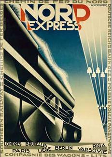
Adolphe Mouron Cassandre's "Nord Express"

Nationality: Ukrainian-French
Born/Died: 1901-1968

Creation Date: 1927
Size: 41.375 x 29.5 in. (105.09 x 74.93 cm)
Media: Color Lithograph
Location: Minneapolis Institute of the Arts, Minneapolis, Minnesota, USA

September 2, 2011

August 15, 2011

July 3, 2011

Sketch by Ken Dingwall

Nationality: Scottish
Born/Died: 1938
Creation Date: 2001
Media: Graphite on paper
Location: Collection of Justin Wisniewski and Laura Bell

Ken Dingwall was a painting teacher of mine at the Cleveland Institute of Art. I admit that as a student I often didn't often understand his advice, but after graduation when I had more time to think about the things he used to say, I was able to see just how wise he was.

This is a small sketch he made in my sketchbook during a meeting in my studio. He was getting annoyed with my bad drawing habits so with this little sketch he reminded me to shade in the major values before worrying about the smaller details. That was a lesson I never forgot and I think it is because I saved this little sketch.

When I was recently studying in Edinburgh, where Ken now lives, he mentioned that I should drop him a line to meet up but I was so busy with school that I never got around to it which is something I regret. Maybe my next visit there will include a quick visit.

June 18, 2011

Unknown Work by Richard Treaster

Nationality: American

Richard Treaster was an artist from the Cleveland area but few people that I know there know his work. Apparently he enjoyed a long, successful career and was so successful he was able to leave his day-job teaching at the Cleveland Institute of Art--a feat repeated by few there. I have only seen a few of his watercolors in person and I assume most of them are in private collections, but the few that I have seen were very nice. I think his critics say he was "too commercial" but since that criticism is completely irrational I simply dismiss it outright.

Ironically, after college I had the good fortune to be friends and roommates with Treaster's grandson for many years and I could see right away that my friend's mom had been painted in several portraits.

May 30, 2011

James Cowie's "The Yellow Glove"

Nationality: Scottish
Born-Died: 1886-1956
Creation Date: 1828
Media: Oil on canvas
Size: 22 x 26.1 in. (56 x 66.3 cm)
Location: National Gallery of Modern Art, Edinburgh, UK

This fantastic painting reminds me of Ayn Rand.

March 15, 2011

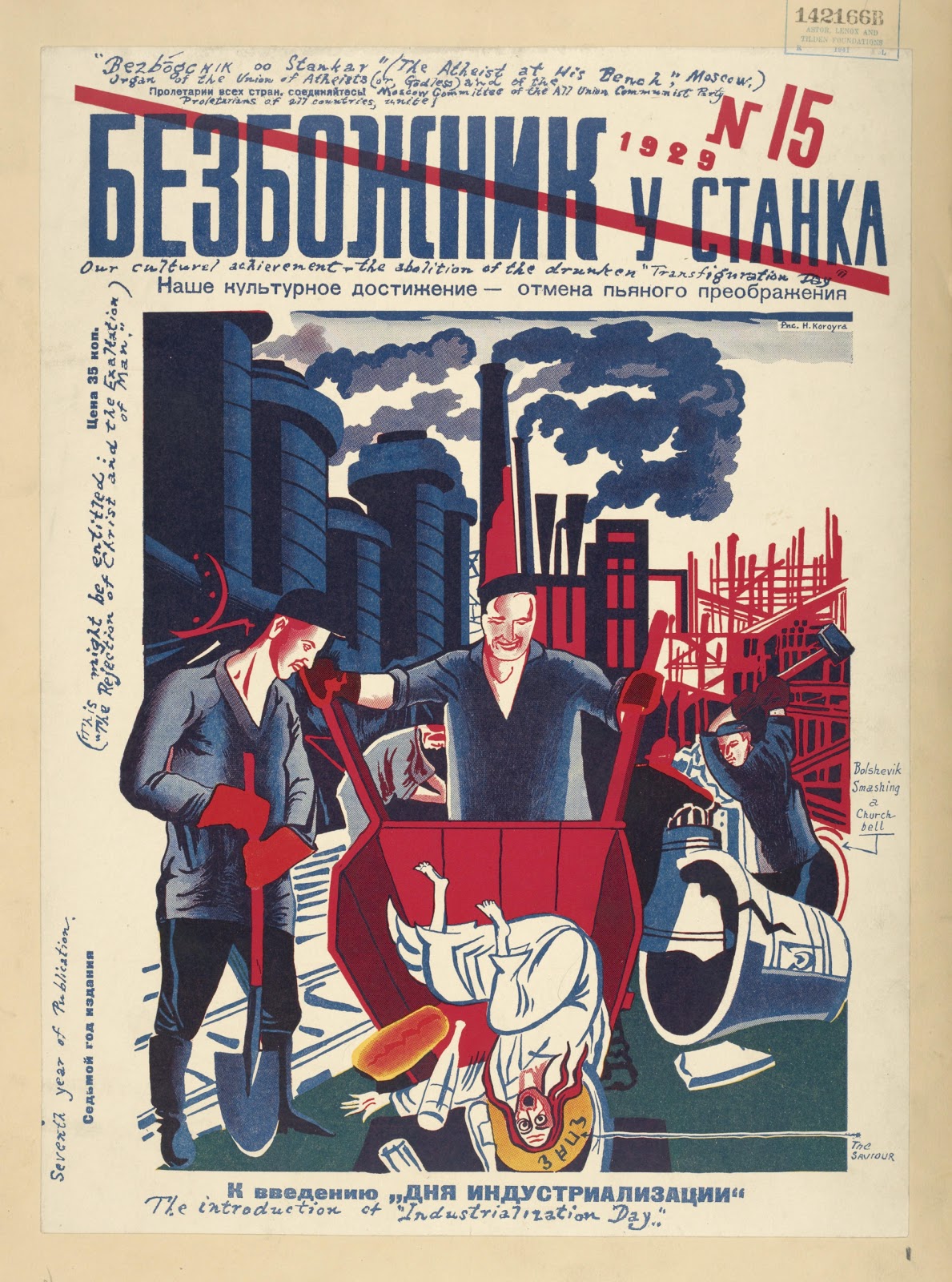
Unusual Depictions of Jesus Week: Jesus in Soviet Russia

Throughout history Christan mythology has been depicted with great variety. Because images of Jesus are so common in the history of art, I thought it would be interesting to explore some of the more unusual works.

March 6, 2011

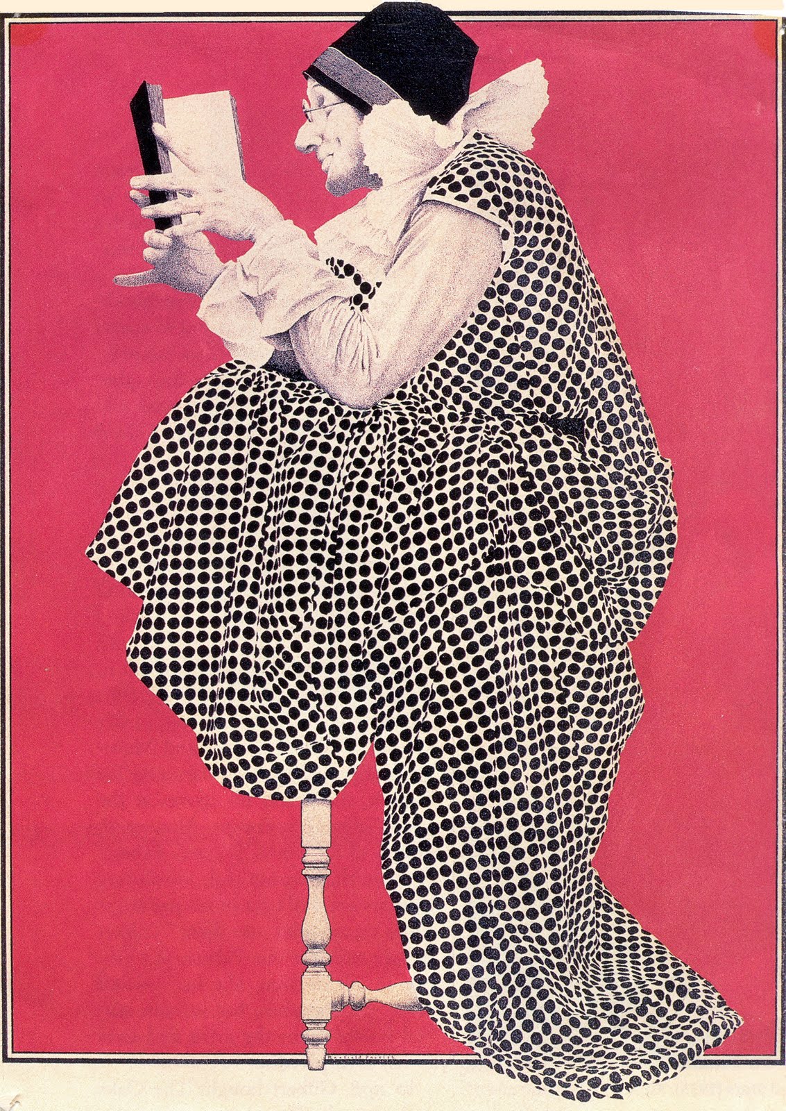
Maxfield Parrish's "The Idiot"


I have no idea why this fantastic painting is called "The Idiot." I once saw this piece incorrectly called "The Scholar" which I personally prefer.